What makes a good website? A practical guide for businesses on the Costa Blanca

Most businesses on the Costa Blanca have a website. Very few have one that works. Here's what the difference looks like in practice, from the things visitors notice to the things they never see.
What makes a good website? A practical guide for businesses on the Costa Blanca
Most businesses on the Costa Blanca have a website. Far fewer have one that actually works.
The gap between those 2 things is rarely obvious from looking at the site. It's in how it performs: how fast it loads, whether visitors understand what they're looking at, whether they have a clear reason to get in touch, and whether Google can make sense of it.
Here's what a genuinely good website does.
It communicates clearly in the first 5 seconds
A visitor lands on your homepage. In the next few seconds, they're deciding whether to stay or leave. The decision is almost entirely based on one question: is this relevant to me?
If the answer isn't immediately obvious, most people leave.
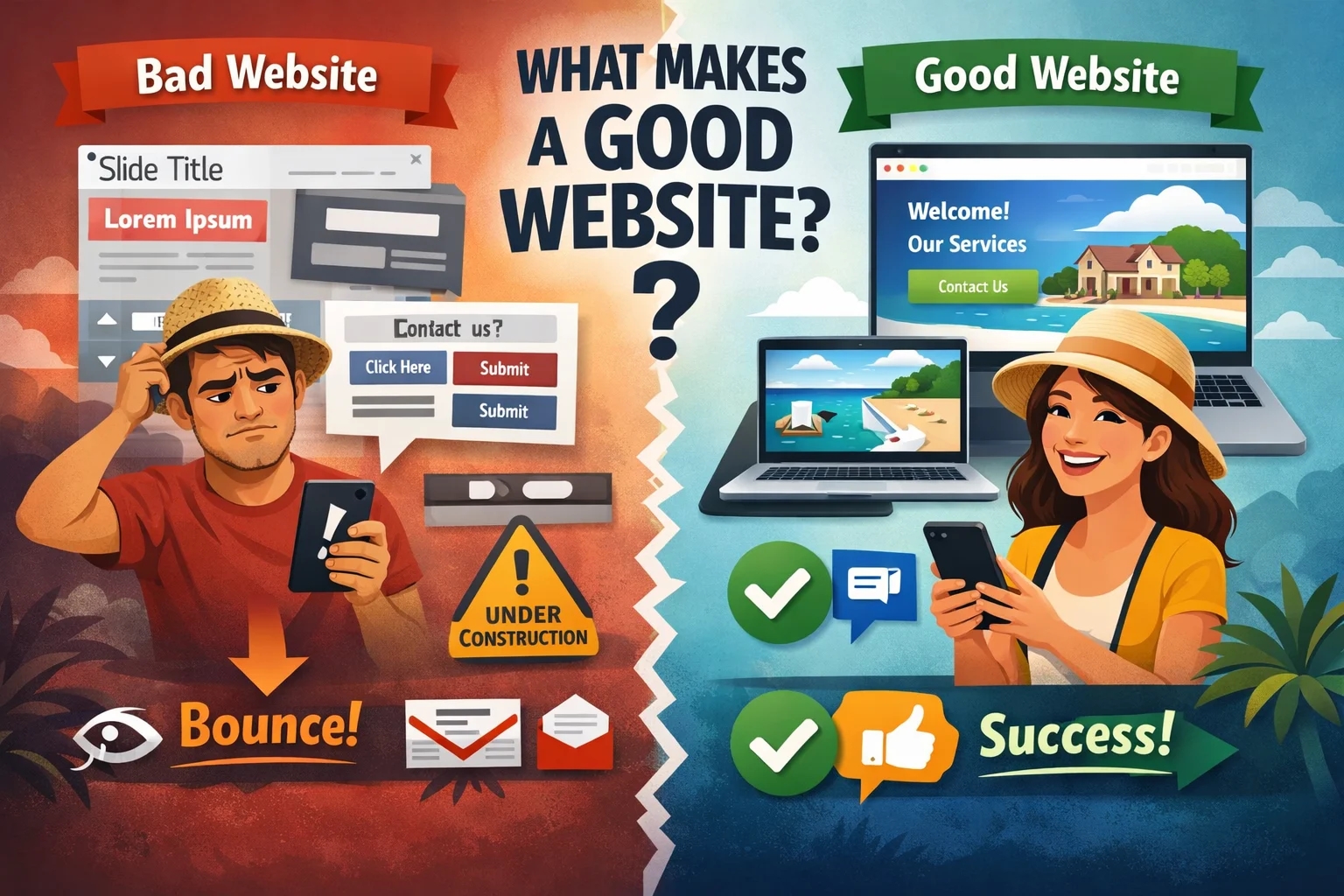
Many websites on the Costa Blanca open with something vague: a large background image, a slogan like "quality you can trust" or "your partner in success," and no clear explanation of what the business actually does or who it serves.
A good website answers the basics immediately: what you do, who it's for, and where you operate. "Web design for businesses in Altea, Calpe, and Jávea" is immediately clear. "Digital solutions for modern businesses" is not.
The homepage isn't the place to be clever. It's the place to be understood.
The small details signal quality
Visitors form impressions quickly. And they notice more than business owners often realise.
Text that's slightly misaligned. A button that doesn't look clickable. A menu that's hard to navigate. Placeholder text that was never removed: "Slide title" or "Write your caption here" sitting in a live page.
None of these things are catastrophic on their own. Together they send a signal: this site was thrown together. And if the site looks like it wasn't taken seriously, the business behind it raises the same question.
A good website is clean and consistent. Every element earns its place. Nothing looks half-finished.
Colour contrast is a readability issue, not a design preference
Some websites use colour combinations that look attractive in a design tool but are genuinely hard to read on screen: light grey text on a white background, blue text on a dark blue background, buttons that barely stand out from the page around them.
On a laptop in a dim room it might be acceptable. On a phone in the Spanish sunshine it becomes unreadable.
The Coolors contrast checker lets you test any colour combination in seconds. International accessibility guidelines recommend a minimum contrast ratio of 4.5:1 for normal text. Below that, some visitors will struggle to read it, and some won't bother trying.
Mobile comes first
More than half of all web browsing is mobile. On the Costa Blanca, where a large proportion of your potential clients are expats browsing casually on their phones, that number is probably higher.
A site that works on a desktop and breaks on mobile: buttons too small to tap accurately, text that requires zooming, images wider than the screen, menus that don't open properly. These visitors are gone in seconds. They don't send a message saying the site was broken. They just leave.
Test on a real phone. Not a browser with a narrowed window. An actual device, with your thumb, the way your clients use it.
Speed decides whether visitors see anything at all
A visitor who waits more than 3 seconds is already thinking about leaving. Most of them do.
This is especially relevant for businesses on the Costa Blanca, where a lot of your audience is browsing on a mobile connection rather than WiFi. Cheap hosting, uncompressed images, and too many plugins are the most common causes. Each adds a fraction of a second. Together they can produce a site that takes 7 or 8 seconds to load on mobile.
You can test your own site for free at pagespeed.web.dev. Enter your URL and Google will give you a score and tell you what's slowing things down. A score below 50 on mobile is a problem worth taking seriously.
There's a clear next step on every page
A visitor who understands what you do and likes what they see still needs to know what to do next. If they have to hunt for a phone number or navigate to a contact page to find a way to reach you, a significant number won't.
A good website has a visible call to action on every key page. A phone number or WhatsApp link in the header. A button that says something specific: "Request a quote," "Send a WhatsApp," "Book a free consultation." Something that removes the friction between interest and action.
Google can read it properly
A website that looks good to a visitor can still be effectively invisible to Google. Missing page titles and meta descriptions. No heading structure. Images without alt text. No sitemap. Content that's thin or copied.
Google needs structure to understand what a page is about and who to show it to. When that structure is missing, the site simply doesn't appear in search results, regardless of how good the design looks.
A good website is built for both its visitors and the search engines that send them there.
If you want to know where your site stands on any of these points, send me your URL on WhatsApp and I'll tell you exactly what I find.
Read more:
- 5 things that drive visitors away from your website
- Why nobody finds my business on Google
- Too many WordPress plugins slow down and weaken your site
- 5 conversion killers on your website and how to fix them